Home Blunder Series: Common Interior Design Mistakes (Part 3)
January 15, 2024 - Michelle Murphy
Can you believe we’re on part three of the Home Blunder Series?!
We’ve already covered a bunch of common interior design mistakes in part one and part two, so be sure to check those out if you haven’t yet.
Part three is all about the fine details with big impacts that get overlooked far too often.
Ok, enough small talk… let’s get into some more home blunders!
Common Interior Design Mistakes
Even the smallest details can greatly impact your overall aesthetic. Being aware of these very common interior design mistakes will lead to truly transformative design outcomes.

Mistake #7: Hanging Art Incorrectly
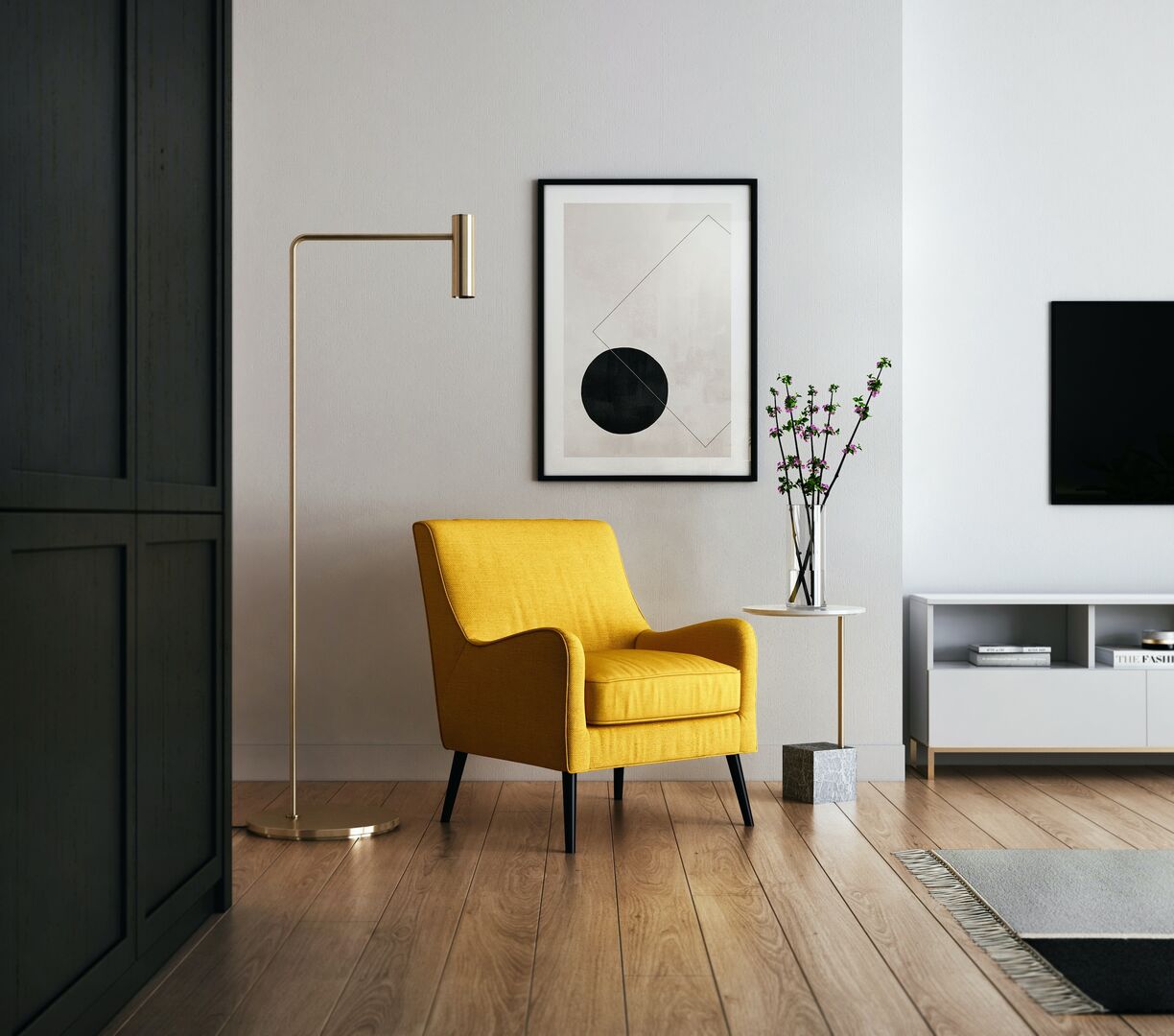
Art goes hand in hand with interior design, but it’s not just what you hang–it’s how you hang it.
Why Art Placement Matters
Incorrectly hung art can be really disruptive to the visual harmony of a room. Whether it’s too high, too low, or out of scale, the overall balance of the space can be totally thrown off by this seemingly small blunder.
Where incorrectly placed art takes away from the vibe of a space, properly placed art complements the room’s dimensions and layout to enhance the overall aesthetic.
What You Should Do Instead
- Consider Scale and Proportion: Choose art pieces that complement the size of your wall and the room. On a large wall, a small painting can look really out of place. An oversized piece might overwhelm the space.
- Method Matters: Weight is an important consideration and can impact your method of display. Too heavy? If it makes sense, try leaning your art instead atop a shelf or credenza.
- Eye Level Is Key: The center of your artwork should generally be at eye level to create a natural, comfortable viewing experience. Eye level is obviously different for everyone, so a good rule of thumb is to keep the center of the frame 57 to 60 inches above the floor.
- Play With Groupings: If you have smaller pieces, consider grouping them for a gallery-like display.

Mistake #8: Misplaced Furniture Arrangement
Of all the common interior design mistakes, banishing furniture to the room’s perimeter is one of the most likely offenders.
Why Furniture Placement Matters
One of the easiest ways to instantly make a room more inviting is to be strategic with furniture placement. Furniture pushed against the walls can make a room feel disconnected and impersonal (it’s also not the most functional), while thoughtfully placed furniture invites interaction and warmth.
What You Should Do Instead
- Float Your Furniture: Allow your furniture to ‘float’ away from the walls for a more intimate and engaging space. Even pushing your sofa away from the wall a foot or so offers enough breathing room to make a difference.
- Create Conversation Areas: Arrange seating in a way that encourages conversation, such as facing chairs and sofas toward each other.
- Consider Traffic Flow: Leave enough space to move comfortably around the room without obstructions. 36 inches is the standard minimum for walkways and anywhere between 14 to 18 inches is ideal between couches and coffee tables.
- Use Rugs to Define Spaces: Rugs can help delineate areas within a room, especially in open plans.

Mistake #9: Overlooking Lighting
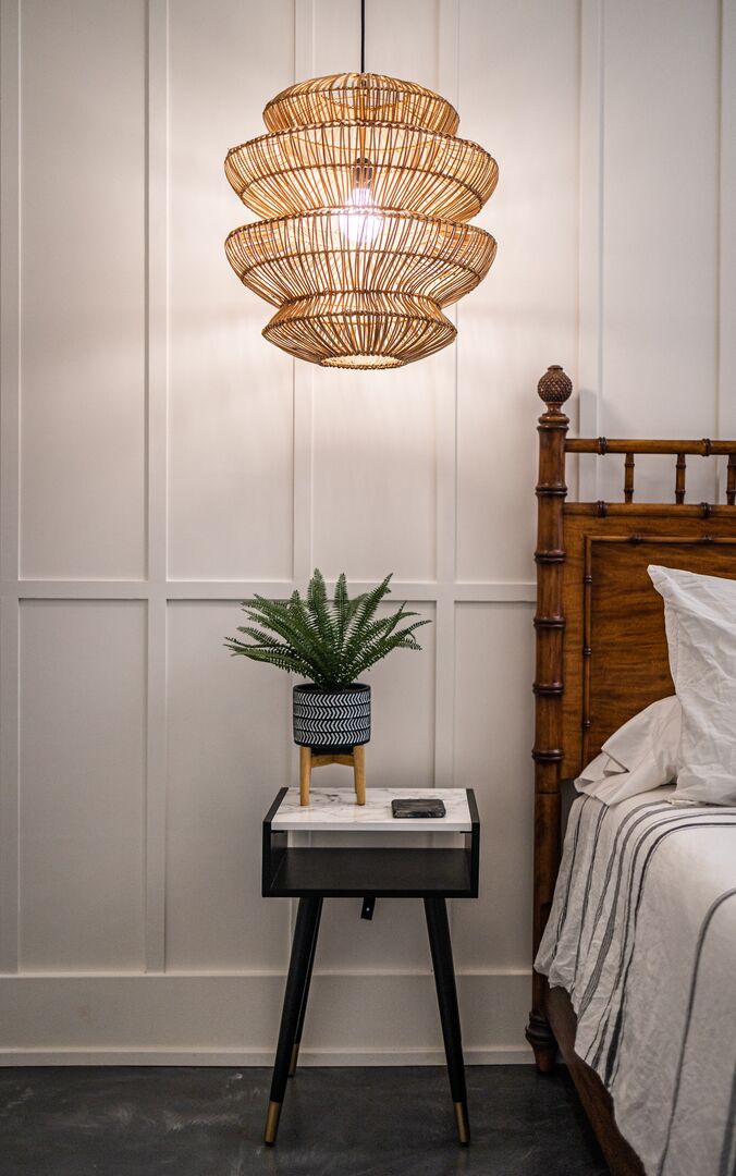
Many homes come with basic or insufficient lighting fixtures, which can affect both the aesthetics and functionality of a space–and your actual mood.
Why Lighting Matters in Design
Did you know that lighting affects your psychological state? Aside from highlighting key design elements and bringing space to life, lighting can alter our perception of a room’s size and shape and even impact our circadian rhythm.
What You Should Do Instead
- Layer Your Lighting: Combine different types of lighting (ambient, task, and accent) to create depth and visual interest.
- Consider Room Function: Match your lighting choices to the activities that take place in each room (desk lamps for offices, etc).
- Upgrade Fixtures: Replace basic, builder-grade fixtures with ones that complement your home’s style and design. Bye bye boob lights!
- Utilize Natural Light: Maximize the use of natural light wherever possible and account for its changing quality throughout the day.
- Add Dimmers: Installing dimmers gives you control over the intensity of light by letting you alter the atmosphere as needed.
Conclusion
Part three is a wrap!
Hopefully, you feel confident putting these tips to work making sure that your art, furniture and lighting are the best they can be for your space. Don’t worry, we’ll be back soon with some more common interior design mistakes. As long as they are happening, the Home Blunder Series will live on!
Until next time.
Want to avoid common interior design mistakes altogether? Just contact MMID!